
Create an Analysis
Turn your charts into a data-driven narrative or dashboard that you can share with stakeholders.
Access requirements
Permission with these capabilities: Create Captures & Analyses
Reach out to your administrator for access.
Tip: Watch this video to learn how to create an analysis.
Create a new analysis
-
On the navigation bar, click Analyses
 .
. -
In the upper-right corner of the Analyses room, click New analysis.
Result: The Analysis Editor appears.
- In the Title box, type a title for your analysis. The title will appear in search results and analysis links.
- In the Description box, type a subtitle or description for your analysis.
Tip: You can also copy an existing analysis and use it as the basis of your new analysis. For more information, see Copy an Analysis.
Choose a layout mode
- In the Analysis Editor, click the More items button
 > Analysis Settings. The Analysis settings button
  may appear directly in the Analysis Editor instead of under More items.
 - Select a layout mode:
- Narrative for a narrower layout optimal for analyses that tell a story with lots of text describing the data, metrics, and visuals you're presenting.
- Dashboard for a condensed layout with less white space, allowing you to fit more data on the screen.
- Apply your changes.
Author content
Content is added as a series of cards. When authoring your analysis, imagine your content organized in a series of rows and columns. As you insert cards, horizontal dividers will appear separating content into different rows. When laying out your analysis, keep in mind that all cards within a row will be displayed on one slide in presentations and exports.
Insert a card
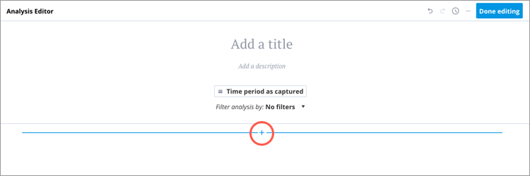
In a new analysis, click the Insert button  to insert a card in a new row.
Insert more cards
Additional cards can be inserted to create a new row or new column within the existing row.
To insert a card, hover over the location where you want to insert the card and then click the Insert button when it appears. New rows can be inserted above or below existing rows while columns can only be inserted from the right side of a row.
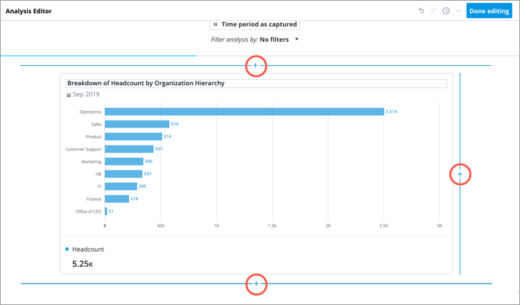
- Additional cards cannot be inserted next to header cards because they span the entire width of the row.
- Page breaks indicate where a new page begins when presenting or exporting your analysis. Viewers cannot see these lines.
Stack cards in columns
If the columns in a row have different heights, you can insert additional cards to stack cards on top of each other.
To insert a card, hover over the column where you want to insert the card and then click the Insert button when it appears.
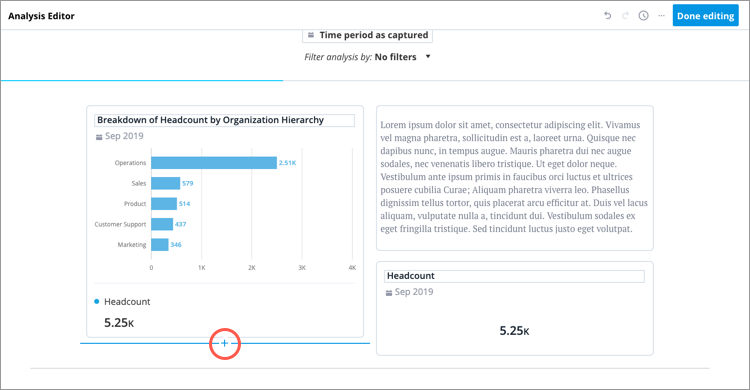
Note: To provide the best viewing experience when presenting or exporting your analysis, we recommend that you avoid creating columns that are too tall. This is because all content in a row will scale to fit on one slide.
Copy and paste cards
You can also copy and paste cards within the same analysis.
To copy a card, hover over the card you want to copy and then click the Copy button  . To paste the copied card, hover over the location where you want to paste the card and then click the Insert button > Paste button
  .
.
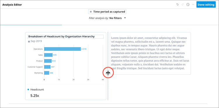
Resize columns
To resize columns, click the dotted line and drag it to the desired width.
Note:
- Chart cards will appear differently based on the width of the column. As the columns narrow, the cards will be optimized for readability:
- Legends will be hidden from visual cards.
- Some chart items will become hidden on visual cards.
- The names and values on metric cards will stack on top of each other.
- The minimum width of visual cards depends on the visual type that is displayed. For example, a Breakdown visual card has a smaller minimum width than an Organization visual card.
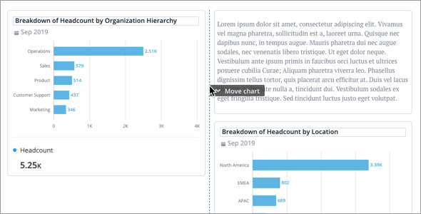
Move cards
To move cards, do one of the following:
| To | Do this |
|---|---|
| Drag and drop | Hover over the card until the cursor changes to the icon. Then click and drag the card to the desired location.
Tip:
|
| Cut and paste | Hover over the card and click the Cut button  . Hover over the location where you want to paste the card and then click the Insert button >Paste button . . Hover over the location where you want to paste the card and then click the Insert button >Paste button . |
 .
.
Delete cards
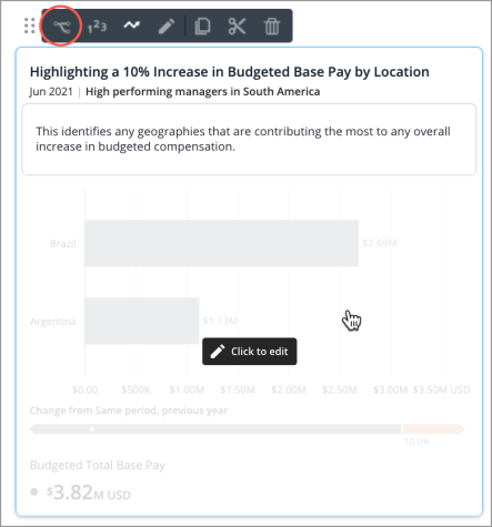
To delete a card, hover over the card you want to delete and then click the Delete button  .
.
Card types
You can build your analysis by adding a combination of headers, charts, text, links, and images. This section describes the card types in detail.
Header
Header cards act as section dividers for your analysis:
- Content is hidden under each header in Collapsed view.
- Headers will appear on a separate slide when presenting or exporting your analysis.
To insert a header card, click the Insert button > Header button  .
.
You can change the header width by hovering over the header, and clicking the Half width button  or Full width button
  . The default is half width.
You can use the formatting toolbar to format your heading in the following ways:
- Bold, italicize, and underline heading.
- Change the heading color. You can select a color or create a custom color using the color picker.
- Align heading left, right, or center.
Tip: Subheadings can be added by inserting a Text card and applying an H2 paragraph style to the text.
Text
You can insert text cards anywhere in your analysis to describe and provide guidance for your charts.
You can use the formatting toolbar to format your text in the following ways:
- Bold, italicize, and underline text.
- Change the text color. You can select a color or create a custom color using the color picker.
- Insert inline links to an analysis or external webpage.
- Create bulleted and numbered lists.
- Align text left, right, or center.
- Apply paragraph or H2 styling.
- Change the font size.
To insert a text card, click the Insert button > Text button  .
.
You can change the text width by hovering over the text, and clicking the Half width button or Full width button . The default is half width.
Chart
You can create charts from scratch or insert a previously saved chart.
Tip: Watch this video to learn how to create a chart from scratch in the Analysis Editor.
To insert a chart card, click the Insert button > Add a chart button  and do one of the following:
- To insert previously saved charts, select the captures you want to insert and then click Done. Captures are inserted to the analysis in the order that they were selected.
Tip:
Use the advanced filters to find captures based on time, visual type, or metric.
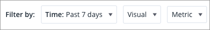
- Time: View captures based on the time they were saved. For example, view captures saved in the past 7 days.
- Visual: View captures based on the visual type of the capture.
- Metric: View captures based on a metric used in the capture. Type a metric name in the Search bar to quickly find the metric that you're looking for.
- To insert a new chart, click Create new chart.
- Build your chart by:
- Selecting the visual type, metrics, and group by attribute for your chart.
- Changing the analysis context.
- Customizing the chart appearance and settings in the Side panel.
- Adding a title to your chart.
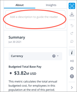
- Adding a description for your chart in the About tab of the Info panel. Think of the description as a piece of guidance to help users understand what they're looking at when viewing the chart in full screen. You can also show the description on the card after it has been inserted in the analysis.
- When finished click Add and Close.
- Build your chart by:
Tip:
- If you are creating multiple charts, click Add and New to insert the created chart to your analysis and open a new chart.
-
If viewers don't have data access to a visual in an analysis, the visual will automatically be hidden.
Fix the time setting
When the data refresh settings for your analysis is set to Update automatically or Select a specific time period, you can change the time setting of individual chart cards. By default the time context at the analysis level will be applied to the individual chart cards (Relative to analysis). However, you can fix the time setting on individual chart cards.
- Change the data refresh settings of your analysis to Update automatically or Select a specific time period. For more information, see Refresh analysis data.
- Click the chart card you want to change the time setting for.
- In the chart, click the Time picker and change the time setting to Fixed.
- Choose the time period and time granularity that you want the chart to be fixed at.
- When finished, click Apply.
Note: Data in charts with a fixed time setting will not change when the time period or granularity of the analysis is changed, even if the analysis has the time granularity synchronized. Fixed charts will be indicated by a lock icon  beside the time period. For more information, see The Time Context.
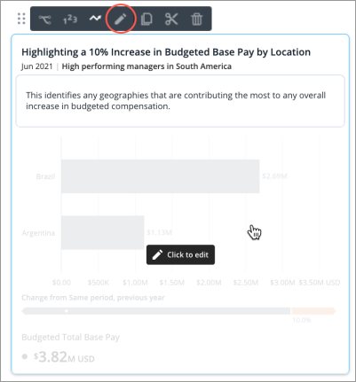
Edit the chart card
After a chart has been inserted, you can click the card to edit the chart. Change the visual type, metrics, group by, filters, chart title, description, colors of visual items, and more.

Change the color of visual items
If your analysis contains multiple visualizations, it is best practice to use a consistent color to represent the same visual item across all visuals. For example, have the color pink represent the Millennials dimension member and the color yellow represent the Gen Z dimension member across all visuals in your analysis. This makes it easier for viewers to follow your data story and helps avoid confusion.
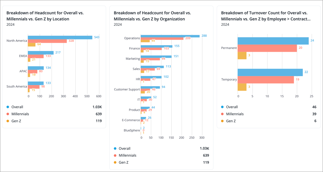
When creating visuals, you can set specific colors for visual items such as metrics, trend lines, dimension members, and data points. Remember to capture the visuals, so you can reuse them in your analysis.
- Click the chart card you want to edit.
-
Click the Change colors button
 on the Visual Actions menu.
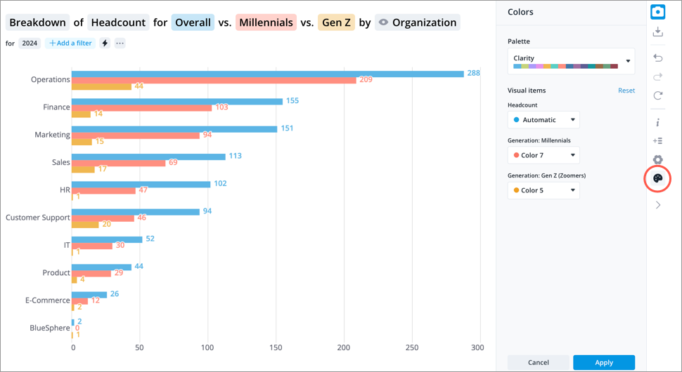
- In the Colors panel, select a color palette.
-
Assign a color to your visual items by changing the selection from automatic to a specific color.
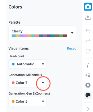
- When finished, click Apply.
- When finished editing the chart card, click Save and Close in the upper-right corner.
- Repeat steps 1 to 6 for each chart card that contains the same visual item. Assigned colors do not sync across charts in an analysis.
Note:
-
The order of colors in the palette dictate the color that is used for visual items as more items and values are added.
-
If a visual item is not assigned a specific color (automatic is selected), the platform will try to select a color from the palette that has yet to be assigned to another visual item.
-
Assigned colors will not carry over to other dimension levels. Users will see different colors when they drill up and down in the visual.
-
Admins can create custom color palettes for you to use. For instructions, see Create a Custom Color Palette.
Change the chart title, description, and analysis context token
You can change the chart title from the card by clicking it.
Once added, you can also change the chart description and analysis context token from the card. For more information, see Edit the Analysis Context Token for a Card.
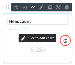
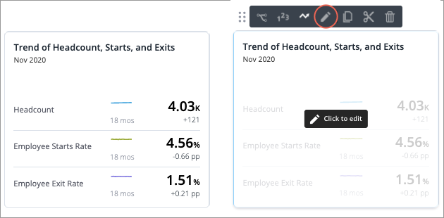
Show a visual or metric summary
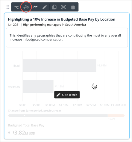
Chart cards can show a visual or metric summary, as shown in the following screenshot.
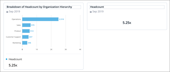
To change the view, hover over the Chart card, and then click the Display metrics button  .
.
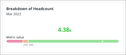
Show traffic light legend on metric summary cards
Metric summary cards with traffic lighting applied can show a traffic light legend, as shown in the following screenshot. In the legend, the white dot represents the approximation of the value to show where in the range the value exists.
To show the traffic light legend, hover over the card, click the Edit card appearance button  .
.
In the Edit card appearance dialog, do one of the following:
- For Breakdown and Trend Breakdown charts:
- Click Show traffic light legend > Save changes.
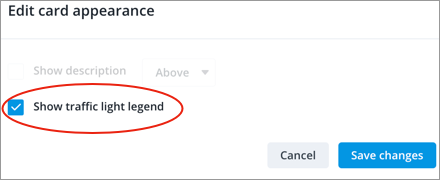
- Click Show traffic light legend > Save changes.
- For Trend charts:
- In the Show visual representation as drop-down, select Traffic light legend > Save changes.
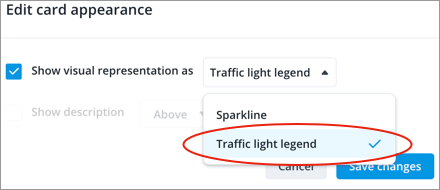
- In the Show visual representation as drop-down, select Traffic light legend > Save changes.
Show description
To provide viewers with additional guidance, you can show the chart description on the card. The description can be displayed above or below the visual or metric summary, as shown in the following screenshot.
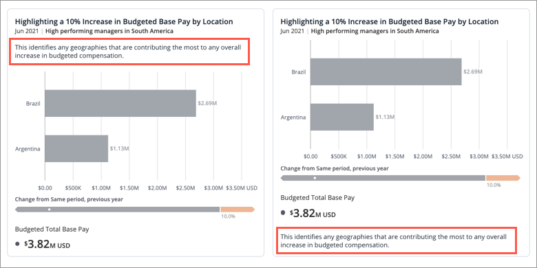
You can add a description for your chart in the About tab of the Info panel.
To show the description, hover over the card, click the Edit card appearance button .
In the Edit card appearance dialog, click Show description and select the position you want the description to appear.
Show sparkline
For Trend charts, sparklines (tiny line graphs that illustrate a data trend) appear by default when they are set to show a metric summary. To turn off the sparkline, hover over the card, and click the Edit card appearance button .
In the Edit card appearance dialog, clear Show sparkline, and click Save changes.
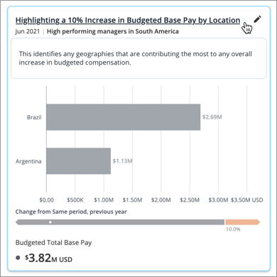
Show key insights
You can turn on key insights for charts in an analysis. Key insights can be displayed above or below the visual or metric summary, as shown in the following screenshot.
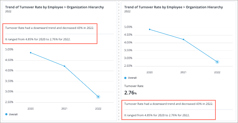
To show the key insights, hover over the card, click the Edit card appearance button .

In the Edit card appearance dialog, click Show key insights and select the position you want the description to appear.
Hide default card information
You can turn off card information such as the title, context, and summary values. Hover over the card, click the Edit card appearance button . In the Edit card appearance dialog, clear the checkbox for the card information you want to hide, and click Save changes.
Specify selected period
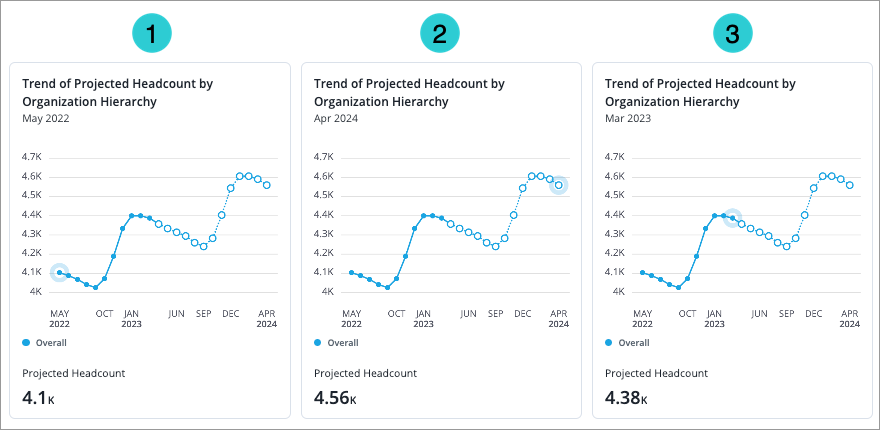
Determine which data point is highlighted in the chart by specifying the selected time period. The metric summary on the card will reflect the value of the selected period.
As shown in the following screenshot, you can set the selected period to be:
- The start of the time window
- The end of the time window
- The latest period
Note: The Specify selected period option is only available:
- When the analysis is set to show data from the time period as captured. The charts do not retain their local time context when the analysis is set to update automatically or set to show a specific time period. For more information, see Refresh analysis data.
- For cards that show a Trend, Trend Breakdown, or Table visual.
To set the selected period on a card, hover over the card, click the Edit card appearance button .
In the Edit card appearance dialog, select the Specify selected period checkbox and choose a period.
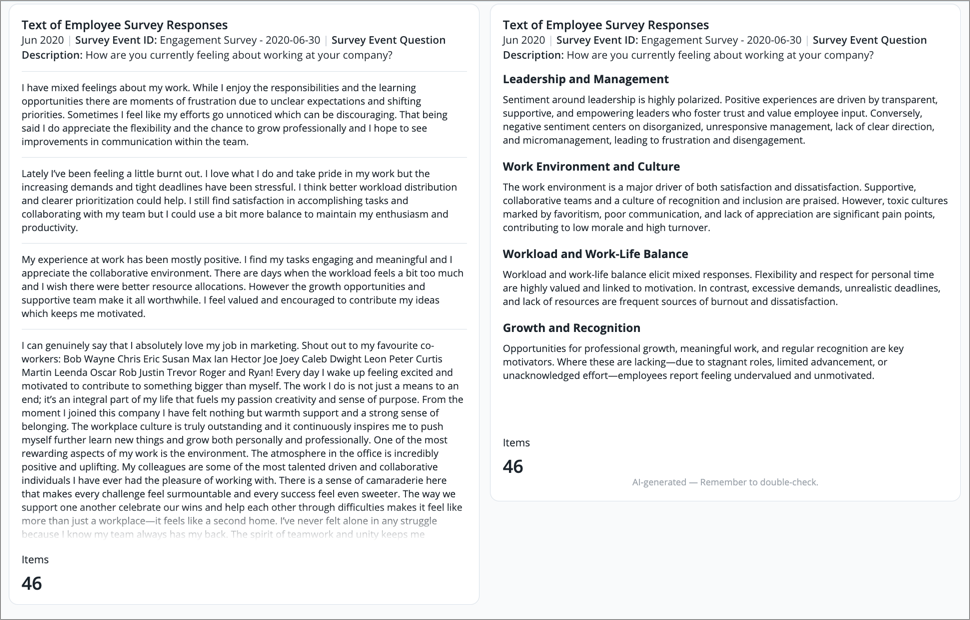
Display AI text summary
Quickly uncover key themes and make faster, better-informed decisions by displaying an AI summary of long text data.
Access requirements
Permission with these capabilities: AI Text Summary and Enable AI Explanation
Reach out to your administrator for access.
Prerequisites: Your organization must opt in to AI features. In the global workspace, click Settings > AI Features.
This option is only available for the Text visual. The following screenshot shows the original text on the left and the AI summary on the right. For more information, see Text Visual.
- In the Analysis Editor, hover over the card, and click the Edit card appearance button .
-
In the Edit card appearance dialog, in the View card as list, select AI Summary.
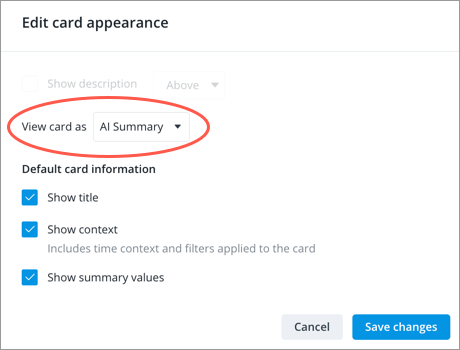
- Click Save changes.
Note: Users who do not have the AI Text Summary and Enable AI Explanation permission capabilities will see the original text instead of the summary.
Make the visual dynamic to the viewer
A dynamic visual uses dynamic elements like chart transformations to allow the visualization to adapt to the user viewing it.
Prerequisites: You must have the Visier AI Insights capability.
To make the visual dynamic, hover over the card and click the Make dynamic button  . For more information, see Create a Dynamic Template.
Carousel
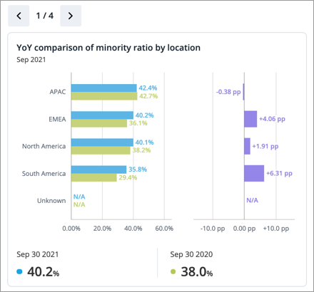
Use the Carousel card to display two or more chart cards in a slideshow format that viewers can cycle through.
Note:
- You can add a maximum of 10 visuals to a carousel.
-
Only the first visual in a carousel will be included in analysis emails, visual downloads, and analysis downloads.
-
If viewers don't have data access to a visual in an analysis, the visual will automatically be hidden.
To insert a carousel:
- Click the Insert button >Carousel button
 .
. - Add charts to your carousel by selecting previously saved charts from your captures or creating new charts. For more information, see Chart.
- When finished, click Add.
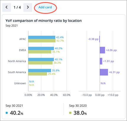
- To add or edit the cards in a carousel, click Add card in the upper-left corner of the Carousel card.
Link
You can link to other analyses or external webpages that contain related content by inserting a link card.
To insert a link:
- Click the Insert button > Link button
 .
. -
In the Add link dialog, do the following:
When linking to an
Do this
External site
- Type the URL of the webpage.
- Type the display text for the link.
- Optional: Add an image to display with the link. Images must be smaller than 5 MB.
Analysis
- Search for the analysis to link
- Type the display title and description for the link. By default, the display title and description is set to that of the analysis.
- Choose how the analysis will be displayed:
- Selected by the author: Use the appearance setting that was set by the author. For more information, see Change the Analysis Link Preview Appearance.
- Title and description: The title and description that you entered in step b as the link.
- Image: The analysis title and a manually uploaded image. The description is visible when you hover over the link.
- Visualization: The analysis title and either the first chart or a manually-selected visual from the analysis, such as a chart or an image. The description is visible when you hover over the link.
- Spotlight: The analysis title and up to 3 metrics from the analysis. The description is visible when you hover over the link.
- When finished, click Add link.
- Before you search for an analysis, you'll find a list of the five analyses that you most recently viewed.
- Search results include all guidebook analyses, analyses that you own, and analyses that have been shared with you.
- The default URL scheme for external webpages is https.
Tip:
Link context
When you link a visual or spotlight, the following contexts will be applied.
Analysis context
The context is determined by merging the analysis context at the following levels:
- Chart: The context of the chart the metric is pulled from.
- Linked analysis: The analysis that the metric comes from has its own analysis context.
- Analysis: The analysis that you spotlight the metric on.
For example, if you have set the following contexts:
- Chart: Tenure < 1 yr.
- Linked analysis: High Performer and United States.
- Analysis: Top Talent.
The link to the visual or spotlight will have a context of: Tenure under one year, High Performer, Top Talent, and United States. If there is conflict between the three context levels, the chart context will take precedence over the linked analysis context and the linked analysis context will take precedence over the analysis context. For example, if the chart level has a context of North America while the linked analysis level has a context of the United States, the chart level context wins and the linked visual or spotlight will show North America as the context.
Time context
The time context that is applied to the linked visual or spotlight follows the time context of the linked analysis unless the chart has a fixed time setting applied to it. If the chart has a fixed time setting applied, the linked visual or spotlight will follow the fixed time setting of the chart. For more information on fixed time setting, see The time setting.
Image
You can add a JPG, PNG, or GIF image, such as your company logo, to your analysis by inserting an image card. Images must be smaller than 5 MB.
To insert an image:
- Click the Insert button >Image button
 .
. - Select an image to upload.
- Optional: Enter alternative text that describes the image for visually-impaired users.
- Click Add image.
- Optional: Adjust the width between Half width
 or Full width
 .
.
To replace an image:
- Hover over the image card and click the Edit button .
- Click the Delete button .
- Select or drag in a new image.
- Click Add image.
Customize viewer settings
Tip: Watch this video to learn how to select the Driving Subject, remove filters, and set up the data refresh settings. These settings determine how users can interact with your analysis.
When you've finished adding content, you can change the following settings to control whether or not viewers can change the analysis context.
- Set a Driving Subject to allow viewers to add filters on the analysis level. If applicable, filters will be applied to all charts in the analysis. For more information, see The Driving Subject.
- Simplify analysis filters to make it easier for viewers to get to insights. For more information, see Simplify filters for analysis viewers.
- Remove the local context (filters that were applied at the time of creation) from the charts in your analysis. For more information, see Remove filters from charts in the analysis Remove filters from charts in the analysis.
- Refresh analysis data to have charts in the analysis show data for the latest time period or a specific time period. For more information, see Refresh analysis data.
Allow editors to reshare an analysis
Analysis owners can give editors the ability to share the analysis with others.
- In the Analysis Editor, click the More items button> Analysis Settings. The Analysis settings button may appear directly in the Analysis Editor instead of under More items.
- In Analysis settings, turn on the Allow resharing toggle.
- Click Apply.
Note:
- To reshare an analysis, editors must have the Share Analysis permission capability.
- Editors cannot generate or delete a sharable link.
For more information, see Share an Analysis.